Member-only story
Neumorphism in user interfaces
How UI trends reach for inspiration into the real world and what problems do we have to solve to make those trends work.

Last week we explored some potential new trends in UI design, with one particular trend gaining a lot of attention on both Dribbble and Instagram lately. This “New skeuomorphism” has been called by Jason Kelley Neuomorphism in the comments. I decided to skip the “o” and the name Neuomorphism came alive.
(Also thanks for all the great comments — I understand that Skeuomorphism was always “just behind the corner” but it’s all about the designers perceived trends vs reality here)
Skeuomorphism anyone?
While various forms of Skeuomorphism still exist in UI’s (your desktop OS trash bin for example) the trend towards a particular part of this style is more apparent.
As Kamil Falana pointed out the switch from lifeless “representations” to something mid-way to realism started happening.

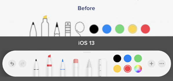
We also noticed a while back, that this change started happening all around us — Apple being a good example. The push towards “super flat and minimal” got a pushback and ended up with a bit more of that textureless 3d feel. People seem to like it.
Halfway back, but better?
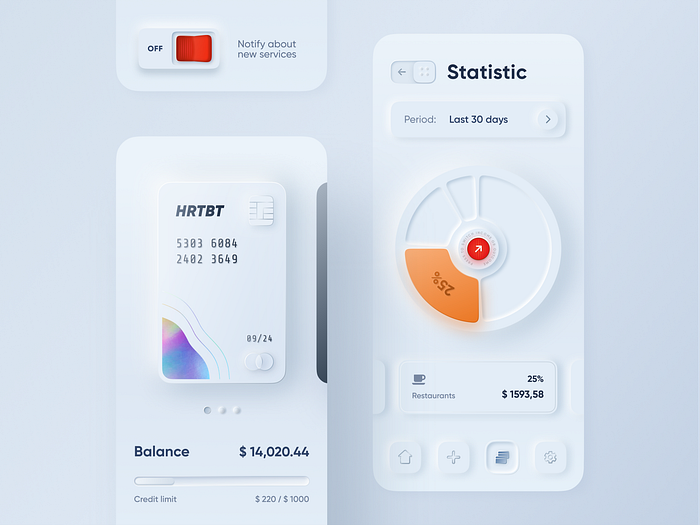
The entire hype started with one Dribbble shot that quickly went viral.

This shot started a trend and while parts of it don’t make a whole lot of sense (a slide-to-go back arrow?) it was precisely what we needed to get excited with UI’s again. Thanks Alex!
What’s the difference?
Since the buttons didn’t change as much, let’s focus on the actual cards concept that makes this such a nice visual style.

